Mobile devices have become an integral part of our lives, serving as tools for everything from simple communication to complex multitasking. But as powerful as smartphones and tablets are, users often switch between devices to complete tasks. They might start filling out a form on their phone, then move to their laptop for more comfortable typing, or begin editing a document on a tablet and finish it on a desktop. These multi-screen workflows are common, but they can also be frustrating if the experience isn’t seamless.
Designing for multi-screen workflows isn’t just about making apps work on different devices—it’s about creating a consistent, intuitive, and efficient experience no matter where users interact with your product. In this article, we’ll explore how to enhance mobile UX for multi-screen workflows and ensure users can effortlessly move between devices.
Step 1: Understand User Behavior Across Devices
Before you can improve the mobile UX for multi-screen workflows, you need to understand how users interact with your product across devices. People often use mobile devices for quick tasks, like checking emails or browsing, and switch to larger screens for in-depth work, such as writing, designing, or editing.
Study How Tasks Flow Between Screens
For instance, someone might research a product on their phone during a commute, save it for later, and complete the purchase on their laptop at home. Mapping out these task flows helps you identify friction points and opportunities to streamline transitions.
Identify Pain Points in the Workflow
Users often face challenges when switching between devices, such as losing progress, inconsistent interfaces, or difficulty accessing saved data. Look at analytics, conduct surveys, and interview users to pinpoint where they experience frustration. For example, are they struggling to log back in on another device? Is the information they saved on mobile not syncing properly on desktop?
Understanding these pain points gives you a starting point for improvement.
Tailor the Experience to Each Device
Not all devices serve the same purpose in a workflow. Mobile devices are often used for quick actions, like scanning documents or replying to messages, while desktops and tablets might be preferred for detailed tasks. Design your product to leverage the strengths of each device, ensuring a complementary rather than duplicative experience.
Step 2: Focus on Continuity and Consistency

One of the biggest frustrations in multi-screen workflows is data that doesn’t sync properly. If a user starts editing a document on their phone and then switches to a tablet, they should see the latest version instantly, without needing to manually save or upload files.
Sync Data in Real Time
Use cloud-based systems to keep data up-to-date across devices. For instance, apps like Google Docs and Dropbox sync in real-time, ensuring users always access the most recent version of their work.
Maintain Visual and Functional Consistency
Consistency across devices helps users feel comfortable and confident. This doesn’t mean the design should be identical on mobile and desktop—after all, each device has different constraints and strengths. Instead, aim for consistency in key elements like icons, navigation labels, and functionality.
For example, if a user learns how to bookmark an article on your app, the process should feel familiar whether they’re on a smartphone, tablet, or desktop.
Allow Easy Resumption of Tasks
Help users pick up where they left off without extra effort. Features like “Continue on Another Device” or “Resume Task” provide seamless transitions. Netflix, for instance, lets users start a show on their TV and continue watching from the same spot on their phone. This kind of continuity builds trust and keeps users engaged.
Step 3: Optimize Navigation for Multi-Screen Use
Navigation is a critical aspect of mobile UX, but it becomes even more important in multi-screen workflows. Users should be able to navigate easily, no matter the device. For mobile, this often means prioritizing simple, touch-friendly menus and reducing clutter.
Design Flexible Navigation
On larger screens, consider how navigation adapts. For example, a sidebar might work well on desktop but feel intrusive on mobile. Use responsive design to ensure navigation elements scale appropriately across devices.
Support Deep Linking
Deep linking allows users to jump directly to a specific part of your app or website, which is particularly useful in multi-screen workflows. For example, if a user receives an email notification about a saved cart, clicking the link should take them directly to the checkout page, whether they’re on their phone or laptop.
Deep linking reduces friction and saves users from retracing their steps.
Include a Universal Search
A universal search feature makes it easy for users to find what they need, regardless of the device they’re using. For instance, if a user searches for a file on their phone, they should be able to access the same search results on their desktop. Implement intelligent search algorithms that work consistently across platforms.
Step 4: Leverage Responsive and Adaptive Design
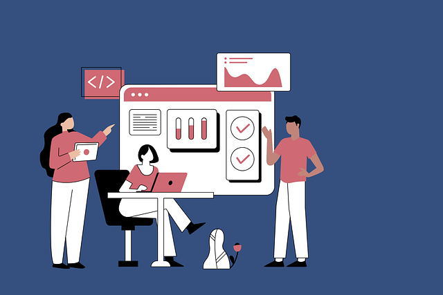
Responsive design ensures your product looks and works well on any screen size. By using flexible grids, layouts, and images, you can create a UI that adapts fluidly to different devices. This is essential for maintaining a cohesive experience in multi-screen workflows.
Build Responsive Interfaces
For example, a responsive design might display a single-column layout on mobile and a multi-column layout on desktop, while keeping the content hierarchy intact.
Use Adaptive Design When Needed
While responsive design is a great starting point, adaptive design takes things a step further by customizing the experience for specific devices. For instance, you might design a unique mobile interface that simplifies complex workflows, such as resizing buttons for easier tapping or using gesture-based interactions.
Adaptive design ensures users get the best possible experience on each device.
Test Across Multiple Devices
Your users are likely using a wide range of devices with varying screen sizes, resolutions, and operating systems. Test your product extensively across different devices to catch inconsistencies or usability issues. Emulators and real-device testing platforms can help you identify and fix problems early.
Step 5: Prioritize Performance and Speed
In multi-screen workflows, users expect speed and efficiency. If your app or website takes too long to load, they’re likely to abandon the task. Optimize your product for fast performance on all devices, particularly mobile, where connections may be slower.
Optimize Load Times
Compress images, minimize scripts, and use caching to ensure quick load times. A tool like Google PageSpeed Insights can help identify areas for improvement.
Streamline Complex Actions
Mobile devices are often used for quick, on-the-go interactions. Long forms, slow transitions, or overly complex workflows can frustrate users. Simplify these processes by breaking them into smaller steps or using autofill and suggestions to save time.
For example, when designing a checkout process, allow users to scan a credit card instead of manually entering details.
Minimize Battery and Data Usage
Mobile users are sensitive to battery and data consumption. Heavy apps or websites can drain resources, making them less appealing for multi-screen workflows. Optimize your product to be lightweight, and provide low-data or offline options when possible.
Step 6: Offer Seamless Collaboration Features

Many multi-screen workflows involve collaboration. Whether it’s a team working on a project or a family planning a trip, your app should support shared access. Features like shared documents, collaborative editing, or group chat options enhance usability across devices.
Enable Shared Access
For instance, Google Drive allows multiple users to edit the same document in real time, whether they’re on a phone, tablet, or desktop.
Add Clear Permission Settings
When multiple users are involved, it’s important to provide clear, intuitive permission settings. For example, allow users to easily control who can view, edit, or comment on shared content. Simple toggles or visual cues can make these settings accessible and reduce confusion.
Include Cross-Device Notifications
Collaboration often relies on timely updates. Cross-device notifications ensure users stay informed, no matter which device they’re using. For example, a notification about a new comment on a shared document should appear on both the user’s phone and desktop.
Step 7: Incorporate Feedback and Iterate
Your users are the best source of feedback for improving multi-screen workflows. Conduct surveys, usability tests, and interviews to learn about their experiences. Ask questions like:
Gather Insights from Real Users
- Where do you encounter difficulties when switching devices?
- Which tasks are easiest to complete on mobile versus desktop?
- What features would make the experience better?
Monitor Analytics
Analytics provide a wealth of data about how users interact with your product across devices. Look for patterns, such as which screens have the highest drop-off rates or where users spend the most time. Use this data to inform design decisions.
Iterate and Improve
Multi-screen workflows are constantly evolving as technology advances and user expectations change. Regularly update your product to address new needs and improve existing features. Iteration ensures your app or website stays relevant and competitive.

Related: Check out our free tools:

Step 8: Embrace Personalization for Multi-Screen Workflows
Personalization is a key ingredient in enhancing multi-screen workflows. By understanding where users left off or what device they’re currently using, you can deliver a tailored experience that feels seamless. For instance, if a user starts drafting an email on their phone, your app should suggest finishing it on their desktop when they log in.
Use Contextual Awareness
Leverage contextual awareness to provide relevant prompts or shortcuts. Features like “Recent Files” or “Resume Activity” make it easier for users to pick up where they left off without hunting for their progress.
Tailor Content for Each Device
Each device serves a unique purpose in the multi-screen workflow. While a mobile device might be used for browsing or quick edits, a desktop might handle more in-depth tasks. Adjust the complexity of content or features based on the device.
For example, prioritize scannable summaries or quick actions on mobile while offering detailed dashboards or full-screen editing tools on desktops. This approach ensures users can complete tasks efficiently without feeling limited by their current device.
Offer Intelligent Recommendations
Artificial intelligence and machine learning can enhance multi-screen workflows by predicting user needs. For instance, if a user frequently switches between a tablet and a laptop for presentations, your app could suggest syncing their latest edits across both devices.
Intelligent recommendations not only improve efficiency but also build trust in your product’s ability to anticipate user behavior.
Step 9: Design for Offline and Low-Connectivity Scenarios
Multi-screen workflows don’t always happen with a stable internet connection. Users might want to work offline on a mobile device during a commute and sync their progress later when they’re online. Designing for offline functionality ensures your product remains usable in any environment.
Enable Offline Access
For instance, Google Docs allows users to edit documents offline and automatically sync changes once they reconnect. This flexibility is invaluable for users who juggle tasks across devices.
Provide Clear Syncing Status
When users work offline, it’s important to communicate syncing status clearly. Include indicators that show when changes are saved locally and when they’re uploaded to the cloud. For example, a subtle icon or message like “Syncing in progress” or “All changes saved” provides reassurance.
Minimize Data Dependency
Heavy data usage can be a barrier in mobile workflows, especially in areas with poor connectivity. Optimize your app to function with minimal data requirements. For example, compress images, load only essential elements, and use caching to reduce the need for repeated downloads.
Step 10: Ensure Security Across Devices
Security shouldn’t add friction to multi-screen workflows. Single Sign-On (SSO) simplifies the login process, allowing users to access your product across devices with a single set of credentials. For instance, logging into a desktop version of an app should automatically authenticate the user on their mobile device.
Implement Single Sign-On (SSO)
SSO not only enhances security but also saves users from the frustration of remembering multiple passwords.
Use Secure Syncing
When users move between devices, data should sync securely without exposing sensitive information. Encrypt data during transmission and at rest to ensure it’s protected. This is especially critical for workflows involving personal information, financial data, or confidential documents.
Offer Device Management Features
Give users control over their account activity by showing which devices are logged in and allowing them to log out remotely. This feature provides peace of mind and ensures security, particularly in shared or public device scenarios.
Step 11: Test and Refine the Experience

Traditional usability testing often focuses on a single device, but multi-screen workflows require testing across multiple devices and transitions. Observe users as they move from mobile to desktop, noting any friction points or inconsistencies.
Conduct Cross-Device Usability Tests
For instance, does the interface feel intuitive on both devices? Are there delays in syncing data? Insights from these tests can guide refinements to create a smoother experience.
Monitor Real-World Usage
Analytics play a crucial role in understanding how users interact with your product across devices. Track metrics like device switching frequency, time spent on tasks, and completion rates. These data points highlight areas where users might encounter friction or drop off.
For example, if users frequently abandon tasks midway on mobile, it could indicate a need for better optimization or clearer prompts to transition to another device.
Iterate Based on Feedback
User feedback is invaluable in refining multi-screen workflows. Actively seek input through surveys, support interactions, and in-app feedback tools. Address common pain points and use feedback to prioritize future updates.
For instance, if users repeatedly request a feature that allows quick switching between devices, incorporate it into your roadmap and communicate the update clearly when it’s implemented.
Step 12: Keep Up with Emerging Technologies
As ecosystems like Apple’s Continuity and Google’s ecosystem become more advanced, they set the standard for multi-screen workflows. Features like AirDrop, Handoff, and shared clipboard functionality create seamless experiences for users. Design your product to integrate with these ecosystems where possible.
Leverage Cross-Device Ecosystems
For instance, enabling users to start editing a document on their iPad and finish on their Mac without manually transferring files can significantly enhance usability.
Experiment with Wearable Devices
With the rise of wearable technology, multi-screen workflows are expanding beyond traditional devices. Consider how your app could incorporate wearable devices like smartwatches. For example, a smartwatch notification could prompt a user to resume a task on their phone or tablet.
Prepare for Future Interfaces
Voice interfaces, augmented reality (AR), and virtual reality (VR) are poised to play a bigger role in multi-screen workflows. Stay ahead by exploring how these technologies could enhance your product’s usability. For instance, voice commands could simplify transitions between devices or AR could provide contextual guidance across screens.
Step 13: Emphasize Accessibility in Multi-Screen Workflows
Accessibility should be at the forefront of your multi-screen workflow design. Users with disabilities may rely on assistive technologies like screen readers, voice commands, or alternative input methods. Ensure your product is compatible across devices to maintain a consistent experience for all users.
Design for Diverse Abilities
For instance, if a user starts interacting with a screen reader on their phone, they should encounter the same accessible structure when switching to a desktop. Labels, navigation, and interactive elements must follow accessibility guidelines across platforms.
Use Consistent ARIA Labels and Metadata
Accessible Rich Internet Applications (ARIA) labels provide essential context for users navigating your interface with assistive technologies. Consistency is key—ensure that ARIA roles and labels are the same on mobile and desktop versions of your app. This reduces the cognitive load for users relying on these features as they switch between devices.
For example, a button labeled “Submit Order” should have the same label across all devices to avoid confusion.
Offer Multi-Device Accessibility Features
Some users benefit from cross-device accessibility tools, like remote control via a companion device. For example, a user with limited mobility might find it easier to use their phone as a remote interface to control a desktop app. Incorporating such features adds a layer of usability that meets specific accessibility needs.
Step 14: Foster User Confidence Through Transparency
Users feel more confident when they understand what’s happening during a device switch. Transparent messaging, such as “Syncing data—ready to continue on your tablet,” reassures users that their progress is being preserved. Avoid ambiguity that could make users hesitate or distrust the process.
Provide Clear Transition Cues
For instance, if a user edits a file on one device and switches to another, a notification confirming “All changes saved and synced” reduces uncertainty.
Communicate Device Compatibility
Make it easy for users to know which devices are supported and how features function across them. If certain features behave differently on mobile versus desktop, communicate this clearly. For example, “Advanced editing tools are available on desktop only” sets expectations upfront.
Transparency helps users plan their workflows without running into unpleasant surprises.
Inform Users About Data Privacy
When users’ data moves between devices, concerns about privacy can arise. Be transparent about how data is stored, synced, and protected. Include simple, clear explanations about encryption and data usage, such as “Your files are securely encrypted during sync.”
Building trust through transparency ensures users feel safe using your product across devices.
Final Thoughts
Designing for multi-screen workflows isn’t just about making your product look good on different devices—it’s about creating an experience that feels natural and intuitive, no matter where users start or finish their tasks. By focusing on continuity, consistency, and user needs, you can build a product that supports seamless transitions and keeps users engaged.
As mobile technology continues to evolve, the importance of multi-screen workflows will only grow. Embrace these principles, stay curious about user behavior, and always prioritize usability. With thoughtful design and a commitment to improving the experience, you’ll create a product that stands out in a world where users expect everything to work together effortlessly.
READ NEXT:
- Are Vanity Metrics Killing Your Marketing Efficiency? Here’s What to Track Instead
- Pinpointing Digital Marketing ROI: Why Your Metrics Aren’t Telling the Full Story
- Unlocking Real ROI in Digital Marketing: The Hidden Costs Draining Your Budget
- How Misaligned Marketing Funnels Are Blocking Your ROI Potential
- Best Digital Marketing Agency In Santa Ana, California
- Best Digital Marketing Agency In San Francisco, California


