In today’s digital landscape, driving traffic to your website is only half the battle. The real challenge lies in converting this traffic into tangible results, be it sales, sign-ups, or other desired actions. Enter the science and art of landing page optimization. For businesses, understanding how to craft and fine-tune these crucial pages can mean the difference between an engaged customer and a lost opportunity.
A landing page, at its core, is a destination—a place where a visitor lands after clicking on a link, an ad, or a call-to-action. While this might sound simple enough, the anatomy of a high-converting landing page is intricate. It’s a blend of compelling design, persuasive copy, and a deep understanding of your target audience’s pain points and desires.
This guide aims to demystify the components of effective landing pages and provide actionable insights to elevate your landing page game. From understanding the basics to diving deep into performance analytics, we’ll walk through the steps needed to ensure your landing pages aren’t just good, but exceptional.
The Basics of a High-Converting Landing Page
Before diving into design and content, it’s crucial to clarify the purpose of your landing page. Is it informational, intended to educate and provide details about a specific topic, product, or service? Or is it transactional, designed to drive sales, sign-ups, or other specific actions? While both types aim for engagement, their structures and emphases can differ significantly.
Informational landing pages often dive deeper into a subject, offering rich content like e-books, articles, or tutorials. Their goal is not immediate conversion but rather to nurture and educate the potential lead.
On the other hand, transactional landing pages are laser-focused on conversion. Every element, from the headline to the call-to-action (CTA), is optimized to guide the visitor toward taking a specific action.
The anatomy of an effective landing page: headline, CTA, visuals, content, and testimonials
A high-converting landing page is more than just a pretty design; it’s a strategically crafted tool. Here’s a breakdown:
Headline: This is often the first thing a visitor sees and reads. A captivating headline should immediately resonate with the visitor, addressing a need or presenting a value proposition.
CTA: The Call-to-Action is the pulse of your landing page. Whether it’s “Buy Now”, “Sign Up”, or “Learn More”, this button or link is where you want your visitors to click. It needs to stand out, be clear, and offer value.
Visuals: Humans are visual creatures. Using relevant images or videos not only breaks the monotony of text but can also explain, emphasize, and persuade more effectively than words alone.
Content: While visuals attract, content persuades. Your landing page content should be clear, concise, and centered around the benefits your product or service offers. Avoid jargon; speak the language of your audience.
Testimonials: Social proof, in the form of testimonials or reviews, adds credibility. Real words from real customers can often be the nudge a potential customer needs to convert.
Importance of Message Match in Landing Pages
Imagine this: You see an online ad promising a 50% discount on a product you’ve been eyeing. You click on it, only to land on a page that showcases a different product altogether or doesn’t mention the discount. Confusing, right? This is where the concept of message match enters the equation.
Message match is the art of ensuring that the content of your ad aligns seamlessly with the content of your landing page. It’s about meeting user expectations. If your ad promotes a particular offer, benefit, or feature, the landing page should reiterate and expand upon that exact message.

Tactics for ensuring your ad’s message aligns perfectly with your landing page
- Consistent Copy: If your ad highlights a specific value proposition, your landing page headline and subheadline should echo that sentiment.
- Visual Consistency: Use similar imagery, colors, and fonts in both the ad and the landing page to create a seamless visual transition for the visitor.
- Relevant CTAs: The CTA on your landing page should directly correlate with the promise or offer of the ad.
- Avoid Overloading: Stick to one core message or offer. Trying to pack in multiple offers can dilute the primary message and confuse visitors.
Design Elements that Enhance Conversion
Role of colors and their psychological impacts
Colors aren’t just aesthetic choices; they carry emotional and psychological weight. For instance, red often signifies urgency or importance, while blue can convey trust and calm. Understanding color psychology can guide visitors’ emotions and actions subtly.
For a startup founder or executive, leveraging color theory means knowing your target audience and their cultural, demographic, or psychographic color perceptions. A/B testing with different color schemes can provide insights into what resonates best with your audience.
Best practices for button design, placement, and text
Button Color: Opt for a color that stands out from the page background, ensuring it grabs attention without clashing.
Button Size: Make it large enough to be noticeable but not so large that it overwhelms the design.
Placement: Commonly, CTAs are placed above the fold (the portion of the page visible without scrolling). However, for longer landing pages, consider multiple CTA placements or a sticky CTA that remains visible as visitors scroll.
Button Text: Be specific. Instead of generic texts like “Click Here”, use action-oriented phrases like “Grab My Discount” or “Start My Free Trial”.
The importance of mobile-responsive design and tactics to achieve it
In an era where mobile browsing often surpasses desktop, a mobile-responsive landing page isn’t a luxury—it’s a necessity. Google’s mobile-first indexing is a testament to this shift. For businesses, this means ensuring that landing pages look and function optimally across devices.
Tactics include:
- Flexible Grid Layouts: Ensure your layout adjusts to screen size.
- Optimized Images: Use images that scale without compromising loading speed.
- Readable Text: Avoid tiny fonts that force users to zoom in.
- Touch-friendly Buttons: Ensure CTAs are easily tappable on mobile devices.

Crafting Compelling Headlines and Copy
Headlines are the gatekeepers of your landing page. A strong headline captures attention, piques interest, and convinces visitors to stay. Given that you have mere seconds to impress a visitor, the headline’s role is monumental.
For startups and businesses, a headline should encapsulate the core benefit or value proposition succinctly. It should answer the visitor’s fundamental question: “What’s in it for me?”
Tactics for writing clear, concise, and persuasive copy
- Focus on Benefits: Instead of listing features, highlight how your product or service benefits the user.
- Use Active Voice: It’s more direct and compelling. “Grab your deal” is more engaging than “The deal can be availed by you”.
- Address Pain Points: Understand your audience’s challenges and show how you solve them.
- Keep It Scannable: Use short paragraphs, bullet points, and subheadings.
Importance of establishing trust through content
In the digital realm, trust is a currency. Your landing page content should not only sell but also reassure visitors. Offer guarantees, showcase testimonials, and highlight security measures. The aim is to make visitors feel secure and valued.
Using Visual Elements to Boost Conversions
In the vast landscape of digital information, visuals serve as immediate attention-grabbers. Images and videos tap into the human brain’s innate tendency to process and retain visual information better than text. They can evoke emotions, create connections, and simplify complex concepts. For instance, while a thousand words might explain a product’s function, a simple demo video or infographic can do it in seconds, leaving a more lasting impression.
Best practices for selecting and placing visuals
- High-Quality Imagery: Ensure images are clear and professionally taken. Blurry or pixelated images can harm credibility.
- Relevance: Every image or video should have a clear purpose and be directly related to the content.
- Alt Text: For SEO purposes and accessibility, include descriptive alt text for each image.
- Avoid Stock Overload: While stock photos can be helpful, overreliance can make your page feel impersonal. Where possible, use original photos that depict real people, products, or events related to your brand.
Forms and Data Collection: Striking the Balance
It’s tempting to extract as much data as possible from visitors, but it’s essential to prioritize. Ask yourself: Do I need this information now, or can I gather it later in the customer journey? Minimize form fields to reduce friction. For instance, if you’re offering a newsletter, often, an email address is sufficient.
Designing forms that are user-friendly and non-invasive
- Logical Flow: Order form fields logically, typically from least to most personal.
- Field Labels: Ensure each field is clearly labeled, and consider using placeholder text for examples.
- Progress Indicators: For longer forms, show progress indicators to set user expectations.
- Error Messages: If a user inputs information incorrectly, display clear, friendly error messages to guide corrections.
Strategies for increasing form submissions
- Offer Incentives: Discounts, ebooks, or exclusive content can be effective.
- Reassure Privacy: Include privacy reassurances next to email fields or links to your privacy policy.
- Use Contrasting CTAs: Ensure your submission button stands out and uses action-driven text.
Implementing Trust Signals
In the digital age, consumers are savvy and cautious. Testimonials and reviews serve as peer endorsements, breaking through skepticism. They offer real-world proof of your product’s or service’s value. Trust badges, on the other hand, signal that a third-party entity vouches for your site’s security or quality.
Best practices for displaying these trust signals.
- Genuine Testimonials: Feature real quotes from real customers, preferably with names and photos for added credibility.
- Variety in Reviews: Don’t only showcase 5-star reviews. A mix can appear more genuine.
- Highlight Trust Badges: Display badges prominently, especially near transaction points. This could be SSL certificates, money-back guarantees, or recognized award badges.
Speed and Performance Optimization
In today’s fast-paced digital era, speed isn’t just a luxury; it’s an expectation. A delay of even a few seconds in page loading can lead to a substantial drop in engagement. Studies have shown that a 1-second delay in page load time can result in a 7% reduction in conversions. In simple terms, if your landing page doesn’t load quickly, you’re leaving money on the table.
Tools for improving page speed
#1. GTmetrix

Features
- Performance Scores: Based on Google Lighthouse & Web Vitals.
- Waterfall Chart: Visualize what resources are slowing your site.
- Historical Data: Track page performance over time.
Pricing
- Free basic plan.
- PRO plans start at $14.95/month.
Pros
- Comprehensive performance insights.
- User-friendly interface.
- Multiple test server locations.
Cons
- Limited free analyses per day.
- Some technical jargon might be confusing to beginners.
#2. Pingdom

Features
- Performance Grade: Rate website against best practices.
- Uptime Monitoring: Ensure constant website availability.
- Page Speed Monitoring: Regularly check site speeds from multiple locations.
Pricing
- Starts at $11.95/month.
Pros
- Real-time outage alerts.
- Detailed reports and insights.
- Intuitive dashboard.
Cons
- No free plan available.
- Mobile speed testing not provided.
#3. Google PageSpeed Insights

Features
- Speed Score: Evaluates both mobile and desktop versions.
- Optimization Suggestions: Offers actionable recommendations.
- Core Web Vitals Assessment: Evaluates user experience quality.
Pricing
- Free.
Pros
- Completely free to use.
- Reliable data from Google.
- User experience focus with Core Web Vitals.
Cons
- Lacks detailed waterfall chart.
- Some technical recommendations may be complex.
#4. WebPageTest

Features
- Detailed Waterfall View: In-depth resource loading insights.
- Multistep Transactions: Test logins, shopping cart processes, etc.
- Advanced Testing: Scripting, custom metrics, and more.
Pricing
- Free.
Pros
- Highly detailed insights.
- Test from multiple locations and browsers.
- Can simulate various connection speeds.
Cons
- Interface can feel outdated.
- Might be overwhelming for beginners.
#5. WP Rocket (specifically for WordPress)

Features
- Cache Preloading: Improve indexing of websites.
- Static Files Compression: Reduce the weight of HTML, JavaScript, and CSS files.
- Lazyload: Load images only as users scroll down.
Pricing
- Starts at $49/year for one website.
Pros
- Easy setup; user-friendly for WordPress users.
- Immediate speed improvements upon activation.
- Regular updates and quality support.
Cons
- Only for WordPress sites.
- Annual renewals can be costly over time.
The importance of server reliability and uptime
Your landing page’s speed isn’t just about the page elements—it’s also tied to the reliability of your hosting server. Frequent downtimes or server issues can derail even the most optimized landing pages. Therefore, invest in quality hosting with a proven track record of uptime and excellent customer support. This ensures that when users click on your ad, they’re guaranteed to reach a functional, fast-loading landing page.
User Experience and Navigation
The user journey on a landing page should be smooth, intuitive, and laser-focused on the end goal: conversion. Every element, from the headline to the CTA, should guide the user towards taking the desired action. It’s imperative to eliminate any potential distractions or obstacles.
- Clear Path: Provide a clear path from the moment a visitor lands on your page to the moment they convert. This can be achieved through logical content progression, intuitive design, and strategically placed CTAs.
- Consistency: Ensure a consistent design and message throughout the landing page. This includes fonts, colors, and messaging.
- Frictionless Navigation: While landing pages typically have limited navigation, any links or buttons present should be clear and easy to interact with.
Eliminating distractions and focusing on the conversion path.
Distractions are conversion killers. Pop-ups, irrelevant links, or too many options can confuse visitors and drive them away.
- Limit External Links: Keep the user’s journey linear and straightforward. Avoid linking to external sites or unrelated pages.
- Single, Strong CTA: Multiple calls-to-action can confuse users. Decide on the primary action you want visitors to take and highlight that.
- Avoid Pop-ups: Unless they serve a direct, beneficial purpose related to the conversion goal (e.g., a limited-time offer), steer clear of pop-ups on your landing page.
A/B Testing and Continuous Improvement
The digital advertising realm is not a set-it-and-forget-it world. Landing pages, though crafted with precision and care, can always be improved. A/B testing, also known as split testing, offers a systematic approach to refining these pages. By creating two versions of a landing page – A (the original) and B (the modified version) – businesses can identify which elements resonate most with their audience.
With A/B testing, each version is shown to an equal number of visitors. Performance metrics such as conversion rates, click-through rates, or time spent on the page are then analyzed to determine which version performs better. This data-driven approach ensures that decisions aren’t based on gut feelings but on real user behavior.
Tools for Effective A/B Testing of Landing Pages
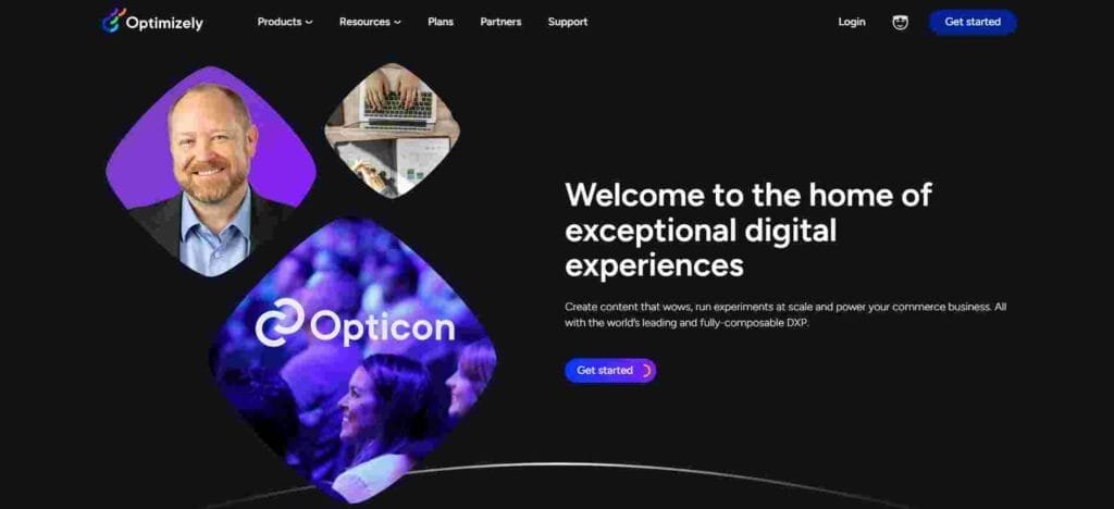
#1. Optimizely
Features
- Experiments: Provides multivariate and split URL testing.
- Results Engine: Calculates results in real-time.
- Personalization: Delivers personalized content and experiences.
Pricing
- Offers a free plan for starters.
- Custom pricing for businesses based on requirements.
Pros
- User-friendly interface.
- Robust analytics dashboard.
- Comprehensive targeting options.
Cons
- Advanced features might require technical expertise.
- Custom pricing can be costly for small businesses.
#2. Unbounce

Features
- Drag-and-drop builder: No coding needed to create pages.
- Popups and sticky bars: Engage users effectively.
- Dynamic Text Replacement: Personalize landing pages for different users.
Pricing
- Plans start at $80/month.
Pros
- Flexibility in design.
- High-converting templates.
- Built specifically for marketers.
Cons
- Limitations in the basic plan.
- Some templates might be generic.
#3. Convert

Features
- Multivariate Testing: Test multiple variations simultaneously.
- Geo-targeting: Deliver content based on location.
- Multi-domain Testing: Test across multiple domains.
Pricing
- Starting at $699/month.
Pros
- GDPR compliant.
- Offers a wide range of integrations.
- Excellent customer support.
Cons
- Expensive for startups.
- Interface can be improved.
#4. Instapage

Features
- Heatmaps: Understand how visitors interact.
- Collaboration Solution: Real-time visual collaboration.
- AdMap®: Visualize ad campaigns.
Pricing
- Starting from $149/month.
Pros
- Easy to use and intuitive.
- Efficient team collaboration tools.
- Integrated ad mapping.
Cons
- Some advanced features are pricey.
- Limited third-party integrations.
#5. Split.io

Features
- Feature Flagging: Release features safely.
- Data Import/Export: Integrates with data lakes.
- Experimentation: Test and learn rapidly.
Pricing
- Offers a free version.
- Premium plans start at $450/month.
Pros
- Offers SDKs for multiple programming languages.
- Robust analytics.
- Integrates well with CI/CD pipelines.
Cons
- Steep learning curve for non-developers.
- Overhead for implementing feature flags.
Strategies for Deriving Actionable Insights from Test Results
A/B testing isn’t just about identifying a winner; it’s about understanding why one version outperformed the other.
Segment Your Audience: Not all users behave the same. Segmenting them based on criteria like location, device type, or previous interactions can offer deeper insights.
Test One Element at a Time: If you change multiple elements between versions A and B, pinpointing the exact change that led to improved performance becomes challenging.
Analyze Qualitative Data: While quantitative data like conversion rates are crucial, consider tools like heatmaps and session recordings to understand user behavior better.
Analyzing Landing Page Performance
Performance metrics serve as a lighthouse, guiding optimizations and indicating where the user experience might be falling short.
Bounce Rate: Represents the percentage of visitors who leave the page without taking any action. A high bounce rate often suggests that the landing page isn’t resonating with the audience or meeting their expectations.
Conversion Rate: This is the percentage of visitors who complete the desired action, be it signing up for a newsletter or making a purchase. It’s a direct indicator of the landing page’s effectiveness.
Time on Page: A metric that sheds light on user engagement. If visitors are spending a significant amount of time on the page but not converting, there might be barriers to conversion that need addressing.
Using Analytics Tools to Dive Deep into User Behavior
Tools like Google Analytics, Hotjar, and Mixpanel offer a deep dive into how users interact with your landing page.
#1. Google Analytics

Features
- User Exploration: Track user journeys throughout your site.
- Demographic Insights: Understand age, gender, and interest data.
- Flow Visualization: See the paths users take through your site.
Pricing
- Free basic version.
- Google Analytics 360 (Premium) comes at a custom price, starting around $150,000/year.
Pros
- Comprehensive and highly detailed insights.
- Integration with other Google tools and platforms.
- Scalable for both small and large businesses.
Cons
- Can be overwhelming for beginners.
- Data sampling in the free version for large datasets.
#2. Hotjar

Features
- Heatmaps: Visual representations of clicks, moves, and scrolls.
- Session Recordings: Watch real users navigating your site.
- Conversion Funnels: Identify drop-offs in your user journey.
Pricing
- Basic Free plan.
- Plus plan starts at $39/month.
Pros
- Intuitive and user-friendly interface.
- Combines qualitative and quantitative data.
- GDPR compliant.
Cons
- Limited data storage on the free plan.
- Not as comprehensive as dedicated analytics platforms.
#3. Mixpanel

Features
- Event Tracking: Understand every user action.
- Retention Analysis: See how often users return after an event.
- User Profiles: Gain a comprehensive view of individual users.
Pricing
- Free limited plan.
- Pricing for custom plans based on data points and features.
Pros
- Focused on user engagement.
- Real-time data updates.
- Versatile visualizations.
Cons
- Steeper learning curve than some competitors.
- Pricing can become high for large enterprises.
#4. Crazy Egg

Features
- Snapshot Reports: View heatmaps and scroll maps.
- A/B Testing: Test changes directly within the tool.
- Confetti Report: Understand clicks segmented by sources.
Pricing
- Starts at $24/month (billed annually).
Pros
- Quick setup and easy to understand reports.
- Integrated A/B testing feature.
- Good for visualizing where users are focusing.
Cons
- Limited advanced features compared to others.
- Some users find the heatmap data limited.
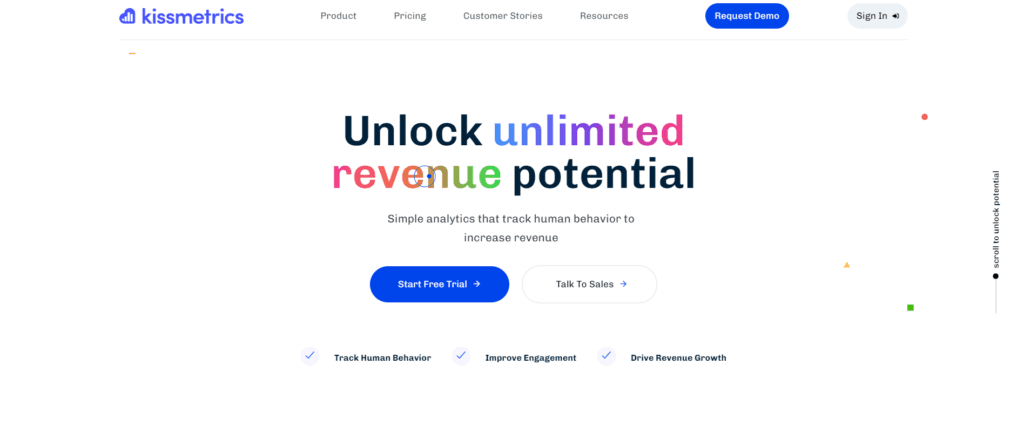
#5. Kissmetrics
Features
- Behavioral Analytics: Track user behavior over multiple visits.
- Automated Email Campaigns: Triggered by user behavior.
- A/B Testing Reports: Understand which versions perform best.
Pricing
- Custom pricing based on business needs.
Pros
- Deep behavioral insights.
- Integrated marketing tools.
- User-friendly reports.
Cons
- Can be expensive for small businesses.
- Interface might feel less modern compared to competitors.
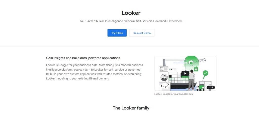
#6. Looker
Features
- Custom Dashboards: Tailored reports based on business needs.
- Data Exploration: Dive deep into datasets.
- Data Integration: Connect and analyze data from various sources.
Pricing
- Custom pricing based on modules and scale.
Pros
- Highly customizable.
- Strong data modeling capabilities.
- Integrates with multiple databases and platforms.
Cons
- Requires technical know-how for setup and use.
- Might be an overkill for basic analytics needs.
- User Flow: Understand the path users take through your page, highlighting areas where they drop off.
- Heatmaps: Visualize where users click, move, or scroll on your page, providing insights into what catches their attention.
- Event Tracking: Monitor specific interactions, like form submissions or button clicks, to assess micro-conversions.
Tweaking and Optimizing Based on Data Insights
Data without action is futile. It’s crucial to regularly review performance metrics, interpret the insights they provide, and then tweak the landing page accordingly. This continuous loop of analyze-optimize-test ensures that landing pages remain dynamic and highly converting.
Addressing and Reducing Bounce Rates
Bounce rates are a critical performance indicator. A high bounce rate signals that something might be off. Understanding the common reasons can guide improvements:
- Misaligned Messaging: When the message or offer in the advertisement doesn’t match the landing page’s content, visitors feel deceived and leave.
- Slow Page Load Times: In today’s fast-paced digital environment, waiting more than a few seconds for a page to load can deter visitors.
- Overwhelming Design: A cluttered layout, too many calls to action, or an overload of information can be overwhelming, causing visitors to exit.
- Lack of Mobile Optimization: With a vast majority of users accessing content on mobile devices, a landing page that isn’t mobile-friendly can be a major deterrent.
- Unclear Call-to-Action (CTA): If visitors are unsure about the next steps, they’re more likely to leave without taking any action.
Tactics for Retaining Visitors and Guiding Them Towards Conversion
Reducing bounce rates involves a combination of design, content, and technical strategies:
- Ensure Message Consistency: The promise made in the ad should match the landing page’s offering. This builds trust immediately upon arrival.
- Optimize for Speed: Use tools like Google’s PageSpeed Insights to identify areas of improvement. Consider compressing images, leveraging browser caching, and optimizing scripts.
- Simplify Design: A clean, intuitive design guides visitors naturally towards the conversion goal. Reduce unnecessary elements and focus on hierarchy.
- Mobile-First Design: Ensure that the landing page experience is seamless on mobile devices. Responsive design and touch-friendly elements are key.
- Clear and Concise CTAs: CTAs should stand out and clearly convey what you want the visitor to do next.
Integrating Social Proof for Higher Conversions
Humans are inherently social creatures, and we often look to others to inform our decisions. This phenomenon is termed social proof, and it’s a powerful tool in digital marketing. When potential customers see that others have benefited from a product or service, they’re more likely to trust the offering and take action.
Ways to Integrate User-Generated Content, Ratings, and Real-Time Stats
- Customer Testimonials: Genuine testimonials provide insights into real user experiences. Incorporate them strategically throughout the landing page to build trust.
- Ratings and Reviews: If your product or service has received high ratings or positive reviews, showcase them. Platforms like Trustpilot or Google Reviews can be integrated into landing pages.
- Real-Time Activity: Tools like Proof or FOMO display real-time user activities, like sign-ups or purchases, creating a sense of urgency and FOMO (Fear of Missing Out).
Example: Brands that Leverage Social Proof for Astounding Results
Brands like Airbnb and Amazon are masters of social proof. Airbnb showcases reviews and ratings of both hosts and travelers, while Amazon’s product pages are rich with customer reviews, ratings, and Q&As. By integrating such elements, these brands significantly influence purchasing decisions, fostering trust and credibility.
The Role of Retargeting in Landing Page Strategy
Retargeting, often referred to as remarketing, is a digital advertising strategy aimed at re-engaging individuals who’ve previously interacted with your brand but didn’t convert. These visitors have shown interest, making them warmer leads compared to fresh audiences.
The digital breadcrumb trail they leave behind—whether by visiting a product page, abandoning a cart, or engaging with content—can be leveraged to serve them personalized ads, bringing them back to your landing pages. This method is imperative for several reasons:
- Increased Conversion Rates: Retargeting helps recapture potential customers who were on the fence, often leading to better conversion rates.
- Brand Recall: Regularly appearing in a user’s browsing space ensures your brand remains top of mind, increasing the chances of a return visit.
- Cost-Effectiveness: It’s often more cost-effective to re-engage a visitor who’s already familiar with your brand than to acquire a new one.
Designing Landing Pages Specifically for Retargeted Audiences
Landing pages tailored for retargeted audiences should take into account their previous interactions:
- Personalized Content: Use dynamic content to reflect the products or services they showed interest in. If they abandoned a cart, showcase those exact products.
- Special Offers: Encourage them to finalize their purchase with time-limited offers or discounts exclusive to returning visitors.
- Feedback Solicitation: If they left without converting, understanding why can be invaluable. Incorporate feedback forms or surveys to gather insights.
Best Practices for Retargeting Ad Copy and CTAs
- Stay Relevant: Ad copy should align with the reason they’re being retargeted. For example, “Forgot something in your cart?”
- Limit Frequency: Overexposure can be counterproductive. Ensure you’re not overwhelming users with ads, causing ad fatigue.
- Clear and Direct CTAs: With retargeting, there’s a history. Use CTAs that directly address returning users like “Continue Where You Left Off.”
Wrapping it up
In the ever-evolving digital landscape, landing page optimization stands out as a pivotal component in achieving superior conversion rates. It melds the art of engaging design with the science of user behavior analytics. Central to success is maintaining a user-centric focus, ensuring each element caters to the visitor’s desires and challenges.
Regularly revisiting and refining your approach based on data is paramount. Remember, while landing pages are crucial, they are part of a larger, integrated digital marketing ecosystem. Mastering their optimization ensures a seamless and impactful customer journey.
Read Next:
- How to Use Google’s Knowledge Graph for SEO
- SEO vs. PPC: Which Brings in More Traffic and Leads?
- What is a SMART Plan? And, Why You Need One
- How to use Mautic: An Explainer
- 11 Best Contract Management Software for You in 2023




Comments are closed.